Another +1 for bring back +/-
Posted under Bugs & Features
I'm exploring ways to add this feature back in a better way and address some of the problems it had. I think it had too many problems to add back as-is:
I didn't go into detail about all the usability problems it had because most of them are obvious. I used the feature myself sometimes. But not all the time. And when it came to a choice between it or nested tags, I chose nested tags.
DeusExCalamus said:
I'd rather have the +/- buttons than nested tags (which I disabled via CSS as soon as I figured out how). But that's just me.
Same. I think the it'd be better if we had the option to turn nested tags and +/- tags on and off at our discretion. Better to let us have a choice rather than force us into one.
evazion said:
You couldn't drill down into multiple tags
I might be misunderstanding you, but isn't that just how the search itself works and has nothing to do with +/-? At least from your examples, those searches are impossible even if you type them in, unless you use "~" searches.
eumesmo said:
I might be misunderstanding you, but isn't that just how the search itself works and has nothing to do with +/-? At least from your examples, those searches are impossible even if you type them in, unless you use "~" searches.
I think his point is that +/- couldn't automate the usage of "~". Searching was always going to take at least some amount of manual input for anything that wasn't adding(+) or omitting(-) a tag to/from the current search.
As for tag nesting; I'm not sure if this is the right place to discuss this, but the *useful* nesting would be something like nesting character tags into copyright / artists tags and them stop duplicating the source on characters names. The current nesting seems to be only visual. That would also help a lot with space ;)
Just chiming in to say that the removal of the +/- buttons was a bad change. They were incredibly useful and much quicker than typing out another tag. Please bring them back.
Wouldn't it be possible to just let it be something you can turn on or off? That way whoever wants to use it can and those who don't well don't.
evazion said:
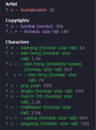
- They took too much space away from tags. The nested tags update would have made this even worse. Just turn the userscript on and look at some Honkai: Star Rail posts. It looks like this. It's a mess.
- These buttons were limited to Gold+ users. That means 99% of users never had them to begin with. The way you're using the site now is the way most people have always had to use the site. If it's that useful to have, then everyone should have it. Yet if I enabled it for everyone, I know there would be just as many people here saying they don't like it and they want to get rid of it. I know this because I've seen more than a few people say they don't like it and ask how to get rid of it as soon as they upgraded to Gold.
Just make +/- an option in settings. With separation between general and other tags (cause general ones aren't nesting, so it's not gonna be a "mess" anyways).
This would be an insanely gargantuan amount of work, and I wouldn't even want it but, has anyone thought of posts having a separate set of tags for each character in the image? It would have utility for searching stuff only on a specific character but I don't think its a good idea this late. I can already imagine people going insane and or dying of exhaustion doing this for absolutely everyone posts.
I don't normally participate on the forums, but when I realized the +/- tags were gone I came here specifically to see why. They're very convenient and I hope an option to toggle them on is added.
I don't even remember what the character tag section looked like without the arrow, and I can't roll back to compare and form an opinion on it. If not for the arrow, I don't think I would have even noticed the change. I do find it particularly ugly for franchises with multiple official costumes, where you wind up with every name listed exactly twice, but one instance of each name is always horizontally offset by the arrow. The nested tag in these cases tends to be the longer one (being literally the same tag but with a costume description appended to the end), so they're also prone to wrapping to a new line, and adding an arrow indenting every other line exacerbates the visual tag vomit. It's more difficult to visually scan alphabetically with the arrow horizontally offsetting half of the tags. I'm not vehemently against nested tags, but if this were an either/or decision, I would pick the +/- buttons every time.
Touristan said:
I don't normally participate on the forums, but when I realized the +/- tags were gone I came here specifically to see why. They're very convenient and I hope an option to toggle them on is added.
I don't even remember what the character tag section looked like without the arrow, and I can't roll back to compare and form an opinion on it. If not for the arrow, I don't think I would have even noticed the change. I do find it particularly ugly for franchises with multiple official costumes, where you wind up with every name listed exactly twice, but one instance of each name is always horizontally offset by the arrow. The nested tag in these cases tends to be the longer one (being literally the same tag but with a costume description appended to the end), so they're also prone to wrapping to a new line, and adding an arrow indenting every other line exacerbates the visual tag vomit. It's more difficult to visually scan alphabetically with the arrow horizontally offsetting half of the tags. I'm not vehemently against nested tags, but if this were an either/or decision, I would pick the +/- buttons every time.
stick this in your custom css (in settings), and it removes the tag nesting: .nested-tag-icon { display: none; }
Put it on its own line.
evazion said:
I'm exploring ways to add this feature back in a better way and address some of the problems it had. I think it had too many problems to add back as-is:
- Not everyone knew what the +/- buttons meant. I've seen multiple experienced users say they never knew what they were for. They never clicked on them for fear of somehow messing something up.
- They took too much space away from tags. The nested tags update would have made this even worse. Just turn the userscript on and look at some Honkai: Star Rail posts. It looks like this. It's a mess.
...Then those "experienced" users have questionable intelligence to the point where they can be safely disregarded.
And call me crazy, but I honestly don't see an issue with that screenshot.
Traze said:
...Then those "experienced" users have questionable intelligence to the point where they can be safely disregarded.
And call me crazy, but I honestly don't see an issue with that screenshot.
It's not necessary to be rude. Not everyone is comfortable touching everything to see what it does. If there's documentation that explained what the +/- did, I've never seen it, and only figured out what they do by accident, I probably wouldn't have ever bothered touching them otherwise.